More than just a score
Checking your credit score won't harm it
*Free for 30 days then £14.95 a month. Cancel anytime.

Join the 28.8 million myEquifax™ users globally
across UK, USA, Canada and Australia as of March 2025

Compare loans, credit cards and car finance
Features of the Equifax Credit Report & Score
Explore the features and benefits of the Equifax Credit Report & Score
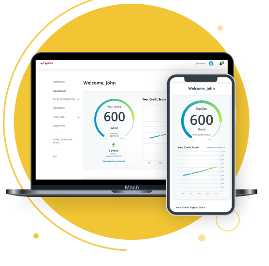
Access to your credit report & score

Protect your identity

A free 12 month tastecard including Coffee Club
Our Products
Equifax
Family & Friends Plan
All the benefits of Equifax Credit Report & Score for up to 3 users, potentially saving £240 per year!
All features of Equifax Credit Report & Score for up to 3 adults
Daily credit alerts
24/7 Identity protection
Rewards with tastecard for the main account holder**
First 30 days FREE
then £22.95 a month.
You can cancel at any time.
Equifax
Credit Report & Score
A detailed view of your enhanced credit report and score out of 1000, including a range of Identity Protection features.
Score updated daily, upon login
Daily credit alerts
24/7 Identity protection
Rewards with tastecard**
First 30 days FREE
then £14.95 a month.
You can cancel at any time.
Equifax
Basic™
Our basic product includes your Equifax credit score, updated monthly, and your free statutory credit report, which shows you the information Equifax has about your credit history.
Score updated monthly
Statutory credit report included
FREE
Upgrade at any time.
*Your first 30 days are free then it’s £22.95 a month for Equifax Family & Friends Plan or £14.95 a month for Equifax Credit Report & Score. You can cancel at any time.
** Main user is eligible for one free digital 12 month tastecard. Access withdrawn upon cancellation of Equifax subscription
Practical tips on everyday money matters
Start your journey towards better financial well-being with our straightforward, jargon-free guidance. Find useful information and tips and tricks on a range of financial subjects.

Looking for business solutions?
